


Back to Basics
What I learnt from 30 value studies + an art exercise to try out 🖍️

Over the last month and a bit, I’ve been taking things back to basics in the studio, and focusing on all things value studies, with 30 paintings in sketchbooks and loose leaf paper. I’ve also had a distinct lack of wild outdoor adventures in the past month, and the mountains have been calling me. Instead, I’ve been living vicariously through my reference imagery - lots of beautiful film photos from winter mountaineering guide books - and imaging adventures of my own whilst walking through more tamed nature spots, local to me. We’re heading north next month for some time in wild nature, and I cannot wait - these new paintings have kept me going until then.
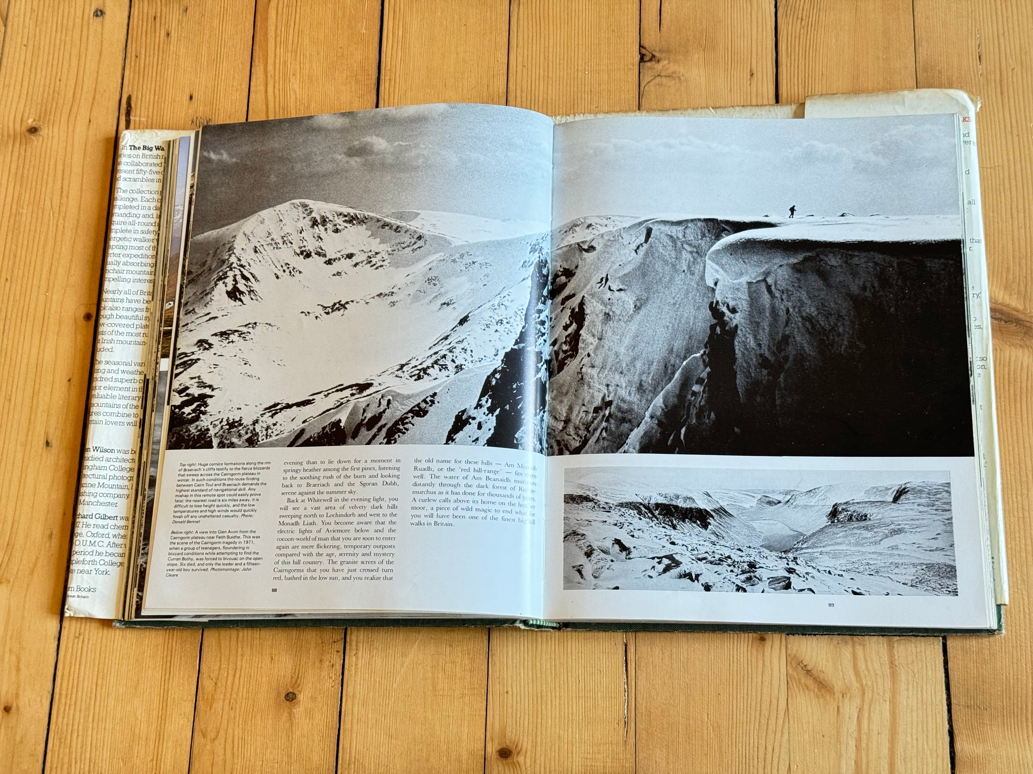
Image: ‘The Big Walks’ book
In this month’s Patreon co-working call, a wonderful Welsh word ‘Hireth’ came up shared by Kevin - and also mentioned by Jan before too - it means “deep longing for a person, place or thing which is absent or lost; yearning; nostalgia; spec. homesickness.”
In a way, there’s a sense of Hireth in these studies, and I’ve been using my art as a way to get back to these places in my mind when I cannot travel there physically just yet. It’s a funny feeling, being away from the landscapes that feel like home, but I am grateful for both memories and my art as a means of transportation. If anything, the separation highlights the importance of having connection with these special landscapes, and makes visiting them all the sweeter.
If you happen to know of a book(s) that shares more words like Hireth, speaking to nature connection and ties to landscape, I would love to hear about it, and learn more about language past and present that describes our connections to nature.
This blog post shares a drawing exercise for you to try, from my latest painting project: a series of 30 exercises, focusing on improving value in art. There’s also some some tips and takeaways - all a summary from my latest youtube video. If you’d like to watch it, you can find it here:
What are values in art?
If you’re new to art, values are the lights and darks in a painting. They are one of the cornerstones that underpin a painting, and something I really want to get better at - mostly, so I can get better at my one true art love; colour! Sounds a bit backwards to improve a use of colour in painting by removing it, but it really helps.
How?
Being able to pin point lights and darks in an image means you get an understanding of depth and perspective. Sometimes, colours can be distracting because, well they’re just so beautiful in their own right. I certainly find myself getting distracted by colour combinations over really choosing the right lightness or darkness of said colour - for whatever my aim is. So, I figured by spending a month learning to see lights and darks better, I’d be able to improve the values in my art when I go back to the technicolour world (and I cannot wait for that, believe me!!!)
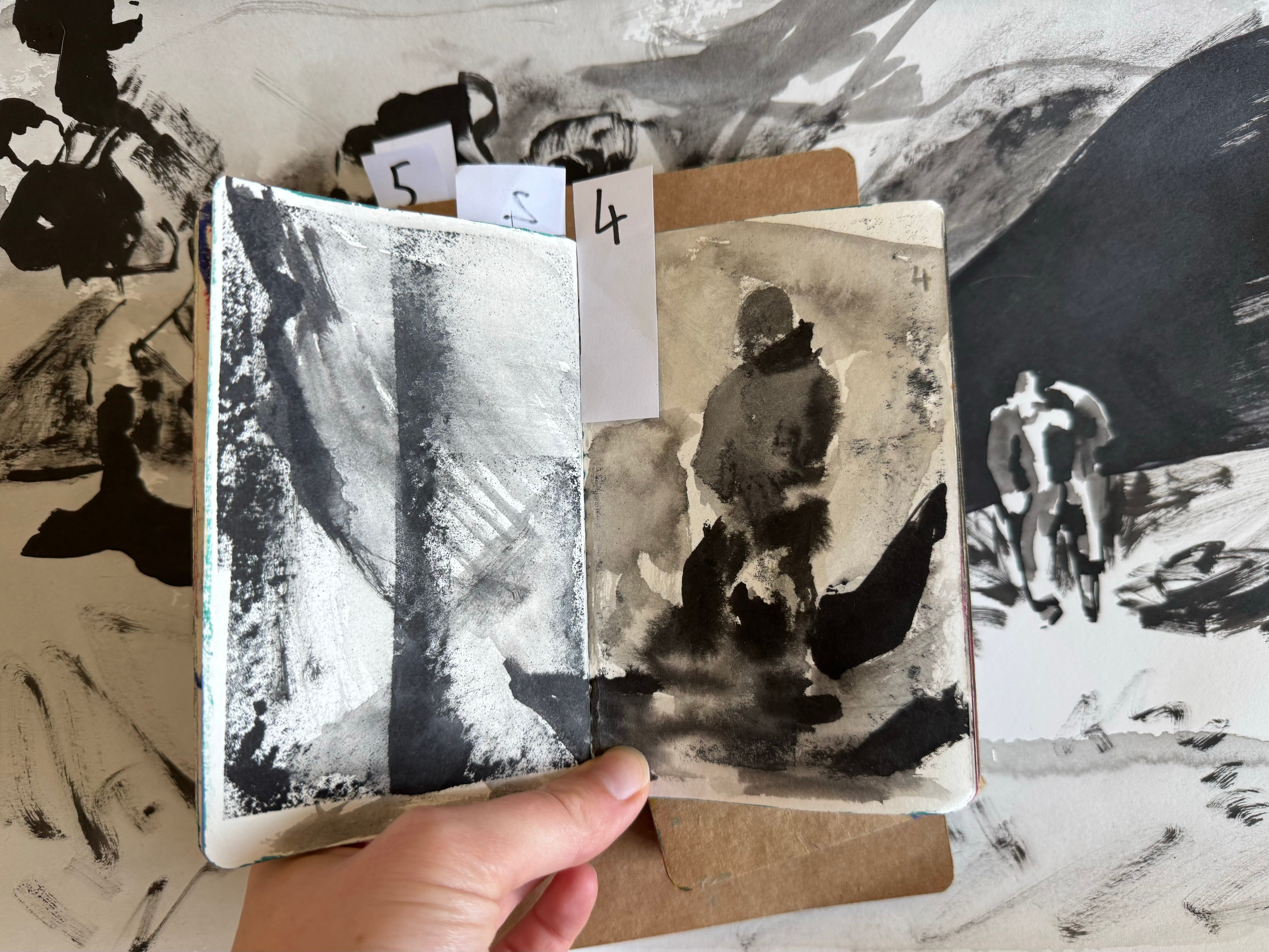
These paintings are definitely value studies over complete works (or what I like to call, ‘painting paintings’). It’s been refreshing to study like this, and put so much time to practice one thing.
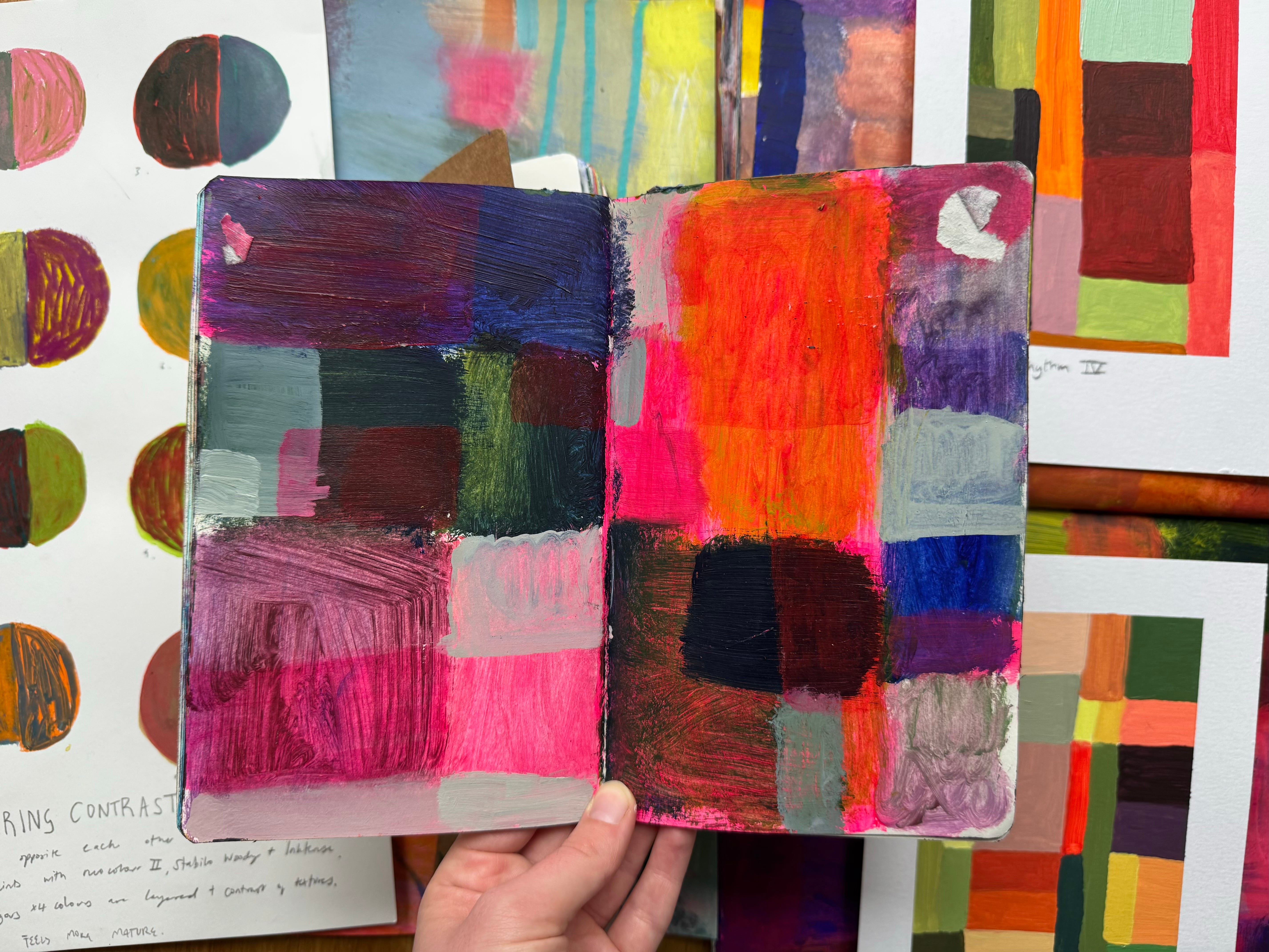
I wanted to make sure my studies reflected my usual ways of painting, with mixed media - so these pieces all explore ink, watercolour, oil pastel, inktense pencils, charcoal, pens, pencils.

Value Study Exercise
If you’d like to try out a value study for yourself, but you’re not sure where to start, here are some tips & steps:
use your usual favourite materials to feel comfortable
set a timer (either for the whole time you want to work, or per layer - info below)
find a reference image and make it b&w
Get yourself a reference image to work from. Pop it in b&w with a filter in your photo library or editing software - all modern mobiles have the option to do this in your photo library.
Turn the image upside down - this stops your brain from ‘reading’ the image, and instead it looks abstract - freeing you from the ‘getting it right’ gremlins so you can just paint what you see, and not what you think you see.
We’re going to create our painting in layers - starting with the darkest areas first. Squint your eyes, and looking at the image, take a look at where the darkest areas of your photo are. This is what we’ll paint first. OPTIONAL: I like to set a timer per layer, to not overwork the painting. I took 5 mins per layer, but choose a time that sounds right to you.
Next layer is mid tones: the greys in the image. In our second layer, fill all the grey you can see here.
Last, you guessed it, the lightest areas! You might want to use some of the white paper (if you worked on that) as the brightest part of your image, or add white media on top.
I like to give myself one more 5-min round to tidy up or refine my piece with all three; dark, mid and light.
You might be thinking; there are so many more tones than just 3?! Well, yes of course. But most of the time, you don’t need to capture all these variations to get a strong image down. It’s better to get 3 really clearly and confidently, and then see if you really need more variation.
If you’d like to watch how I approach this exercise, you can watch it in my youtube video here:
And if you’d like to dive deeper into value studies, I have a video tutorial over on my Patreon, The Outdoor Sketchbook Collective here:
What’s next? I’ve a few more experiments or studies I’d like to try. Here are my ideas to take forwards:
Repeat the project, but through abstracts instead of realistic scenes
Work from reference imagery that’s in colour instead of B&W to challenge myself to see value even better
Translate these B&W value studies into limited colour-palette value studies
Some reflections from this project;
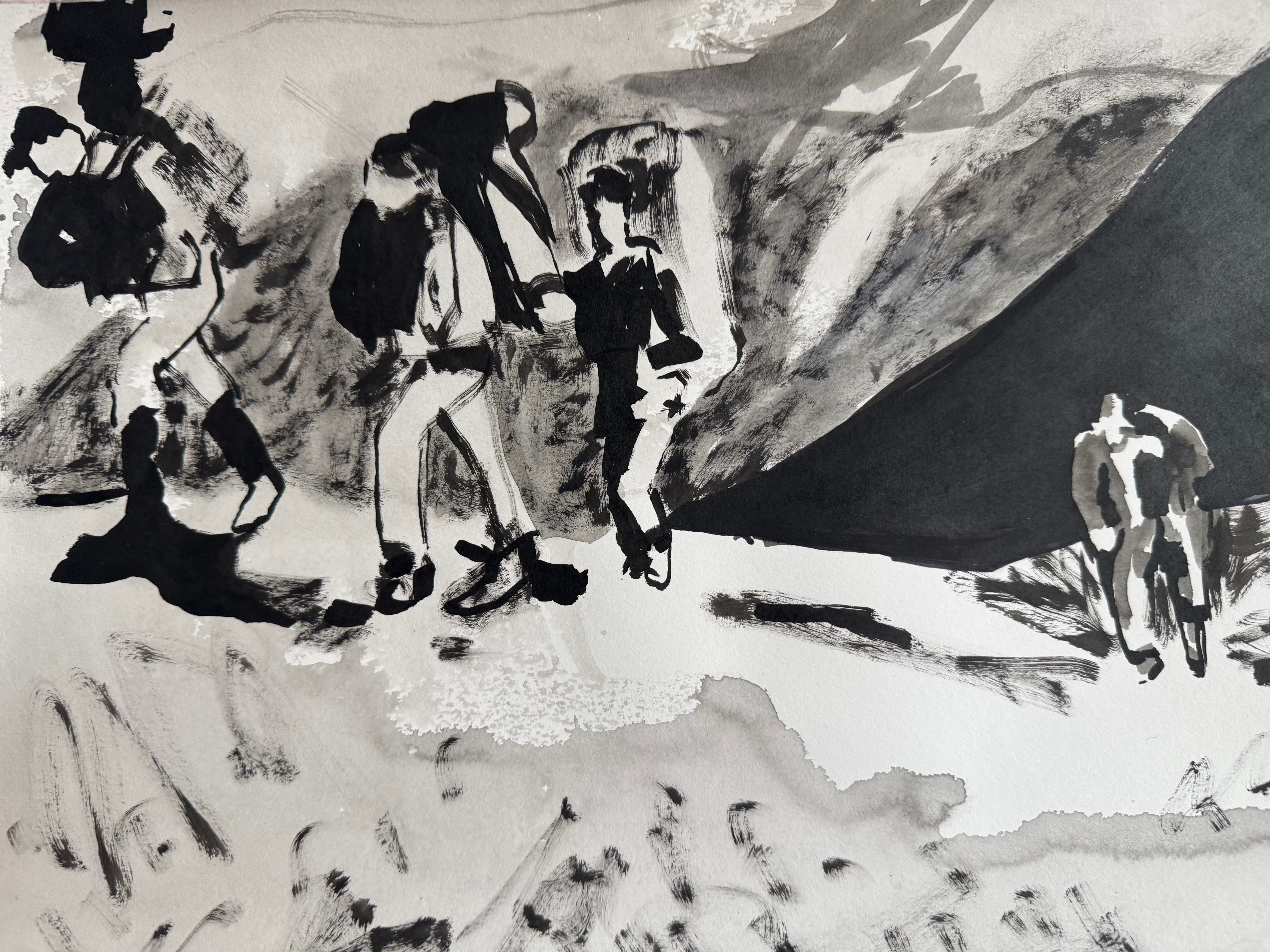
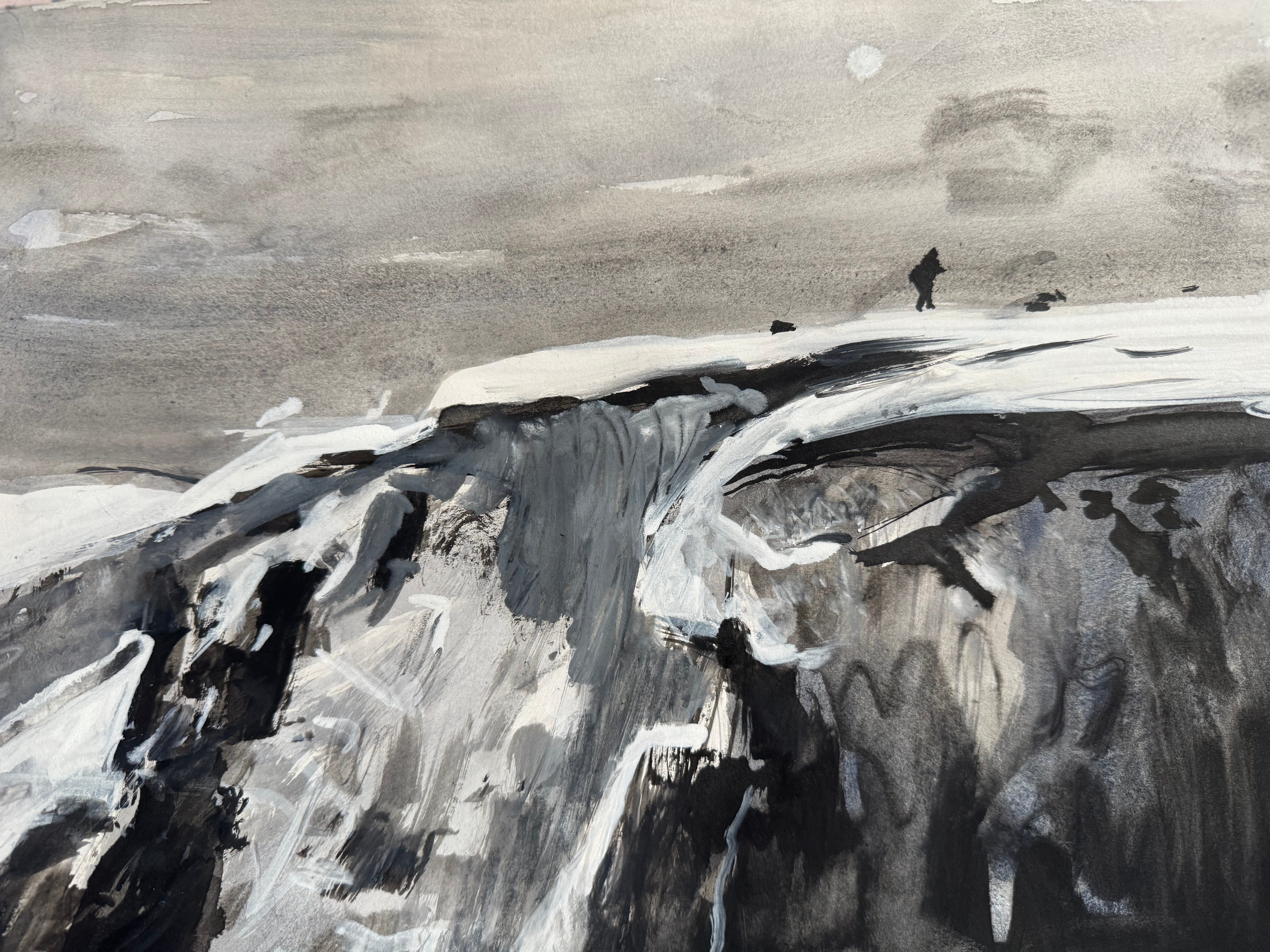
I feel like I improved at capturing figures in landscape, a little side quest I wanted to work at
It highlighted my love for mixed media, textures and patterns
I feel like I saw progression throughout the project
I think I really practiced seeing more than anything else, and think it’ll help me notice more details when I’m out and about in the world 🌍 🌿
When I was working on this value study of a figure, a little sentence or story popped into my head. It reads “The explorer looked out over the vista to the mountains in the distance, and was reminded of how big the world is. In the scale of the landscape, the explorers worries shrunk into insignificance. Such is the reward of walking.”
Including the figures in landscapes, these studies felt much more narrative driven. I’ve no idea if this will lead anywhere, but I enjoyed the feeling of stories joining images too, and am leaving this door open to see if it takes me anywhere in future work!
In the mean time, I’m off to reward myself by painting with ALL the colours for a wee while, and relish in just how much fun, joyous and life-giving that is. In lieu of recent world events, I think it’s safe to say we all need a bit more colour and positivity in the world 🌎
See you Outside,

Hi Orla,
Thank you! I loved this. I love to turn my work black and white to look at values. It can surprise you sometimes as some values that you think are mid, are actually light so it can be very helpful.
Love your layering idea. I will be trying that for sure!
Great info. I love that your love of art and nature comes beaming through In your words, and you're always so very generous with your sharing. So, again, thank you! x Nell.
Thank you, Orla, so helpful to a novice like myself but just really interesting too. There’s a book by Robert Macfarlane -Landmarks- which is about words and landscape and might be something you’d enjoy. Also Thirty Two Words for Field by Manchan Magan maybe.